Blog | Artisan Jewelry Gallery | Berkeley, Oakland, the San Francisco Bay Area & Collectors Nationally

Shibumi Gallery

Christina Odegard: MATIN

Artist ProfileApril Higashi

04/07/2016

Shibumi Gallery, Berkeley, California, USA

By Jessica Hughes
Originally Published On Art Jewelry Forum

CO1.jpg

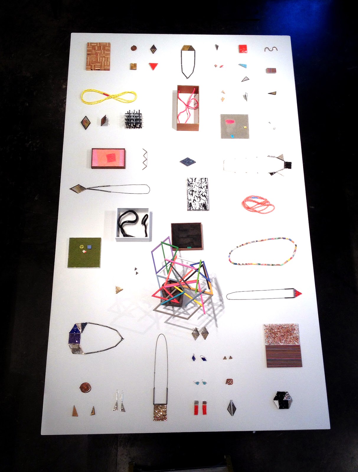
Christina Odegard’s deep appreciation for the beauty and elegance of natural materials, as well as her extensive exploration of form, is apparent in her work. Meanwhile, “shibumi” is a Japanese word referring to a particular aesthetic of simple, subtle, and unobtrusive beauty. So it’s no surprise to see Christina Odegard’s work featured at the Shibumi Gallery in Berkeley, California.

Jessica Hughes: Can you tell us about your background?

Christina Odegard: I grew up in a rural community in England, about halfway between London and Brighton on the southeast coast, although both my parents are American. I spent many a day roaming our family farm, exploring nature. I attended an alternative school, which taught many traditional crafts, fostering my love of the arts.

I’ve read that you came from a family of artists. What made you decide to go into the jewelry field?

Christina Odegard: I attended Rhode Island School of Design (RISD), thinking I would continue studying fashion design, as I had been working in costumes and fashion. After a foundation year, I had to decide my major, and new experiences led me to the jewelry and light metals department.

Can you talk a little bit about your process and what inspires you?

Christina Odegard: I’m very interested in the work, lives, and processes of many artists. Artworks from ancient to contemporary inspire me, but my inspiration also comes from the process of transforming natural raw materials. Working with these diverse materials informs a direction to create a form which is quiet and elegant, yet maintains a simplicity of its origin.

Your show at Shibumi Gallery is open from March 12 through May 1. Can you tell us about the pieces you’re presenting there?

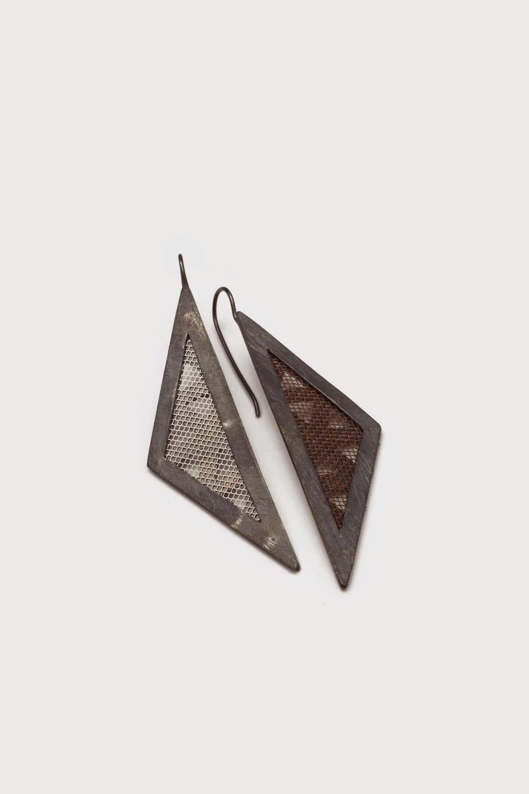
Christina Odegard: For this show I was interested in using black as a unifying theme. A few summers ago, my husband, daughter, and I spent some weeks traveling through Iceland. There, inspired by the dramatic lunar landscape, I picked up some obsidian, adding to a growing collection of black material. These blacks are all so diverse, yet subtle and quiet. For this show I have also included black diamonds, jet, ebony, horn, coral, and tourmaline, exploring further subtleties of the shade.

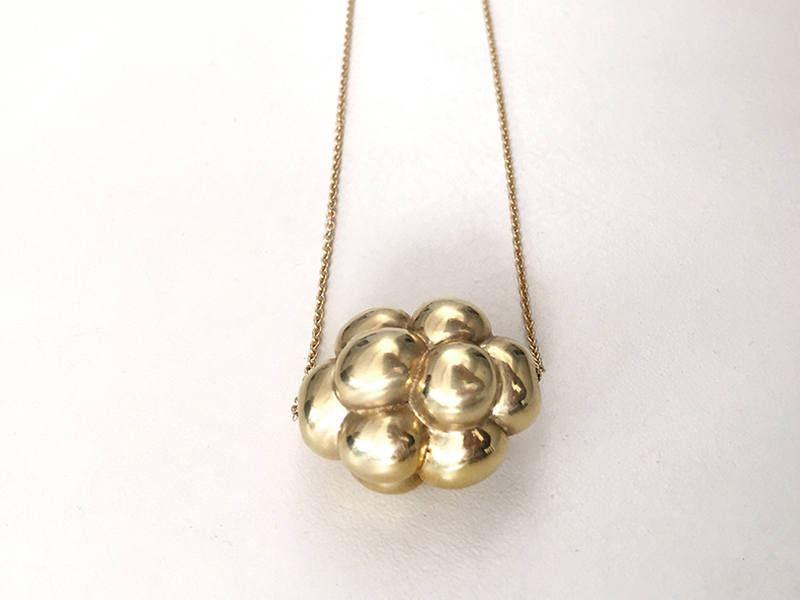
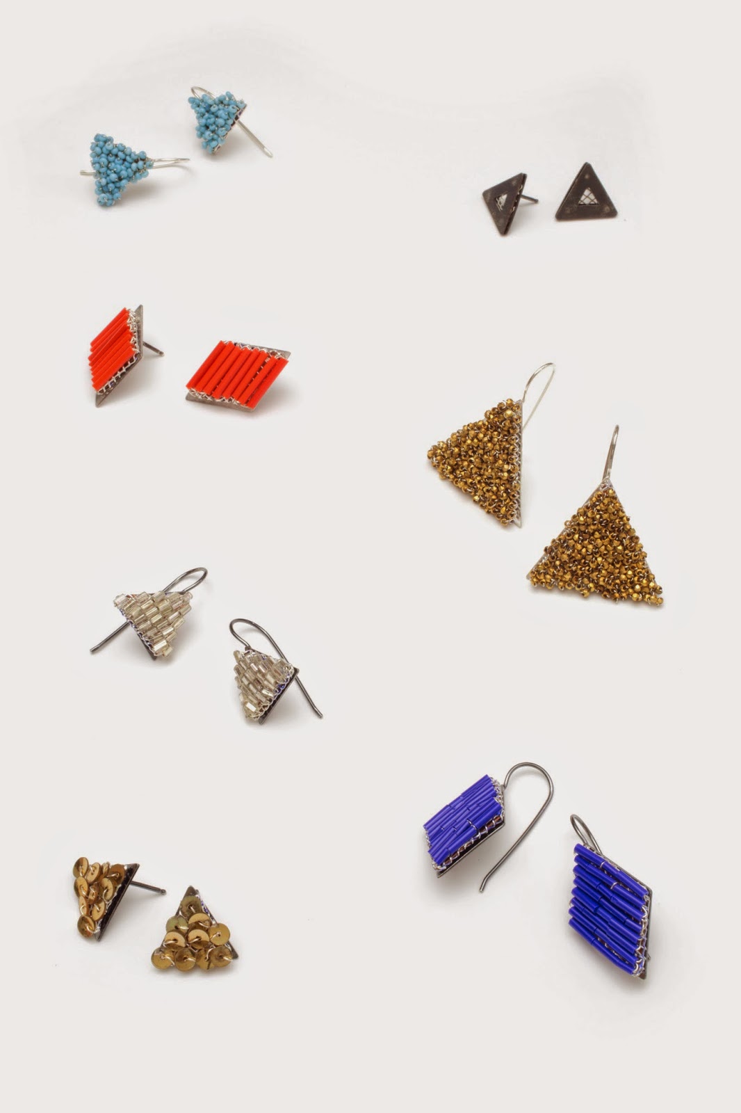
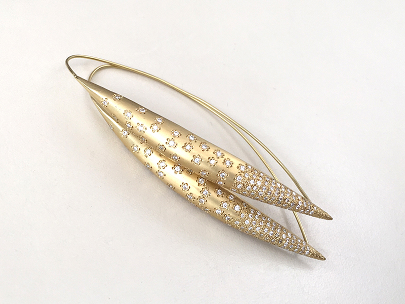
You’ve been carving or casting a similar shape—the cluster—in a variety of materials (jet, horn, tourmaline, gold). What dictates the use of one material over another in each of these instances?

Christina Odegard: The cluster form is a fascinating form to carve, as from all angles it can look different. After each cluster I carve, I still feel there is more to discover; I can refine it, perfect it, explore deeper. Thus it’s interesting for me to carve the cluster in different materials, to see how each responds. It’s like a question that never gets answered, but it’s still fascinating to ask it again and again.

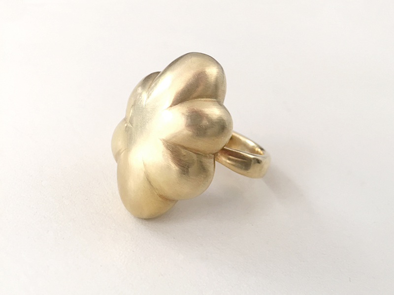
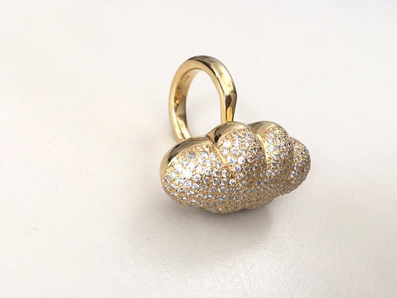
Proposing variants on the same theme suggests an interest in developing design solutions into ranges (I am thinking for example of the tourmaline, the gold, and the pavé version of your Cloud ring). Contemporary jewelers tend to be timid about producing work across materials, preferring the art logic of developing various works using the same material and process. Does that make you a “designer”?

Christina Odegard: I’m not really concerned about labels. When I’m interested in a form or idea, I will pursue it until it no longer holds a mystery for me. Using different materials is an exploration, and can push me technically and artistically.

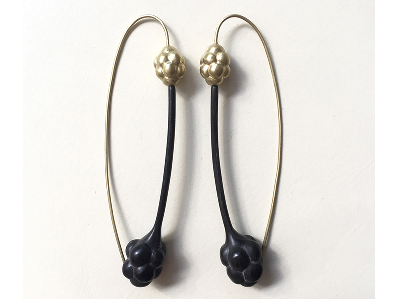
Among these materials, bison horn is unusual. The power and malleability of that material is particularly apparent in your Bison d’Or earrings. How did you begin working with it, and why do you like it?

Christina Odegard: Horn is very malleable, and it can be cut and carved in so many ways. It’s also a material used in ancient/primitive jewelry, which interests me.

You’re a jeweler and a sculptor. Do you approach creating jewelry differently than sculpture?

Christina Odegard: The jewelry and sculpture differ primarily in size. I approach them similarly, although for me the jewelry has to work on the body, complement the beauty of the wearer, and not dominate or take over. Sculpture can stand alone, responding to its surroundings, but not limited by them. I have created a series of sculptural bronze pieces, which is a material I haven’t used in jewelry.

CO7.jpg

With your husband, you founded the gallery called Matin in Los Angeles. Does being a gallerist affect the way you make jewelry? Does being a jeweler affect the way you choose art and artists for the gallery?

Christina Odegard: My husband, Robert Odegard, is the primary gallerist for Matin. We are interested in a particular aesthetic, quality and beauty. This is what informs our goals for the gallery.

From the perspective of an artist and a gallerist, do you have advice for emerging artists?

Christina Odegard: Work hard and be authentic.

What projects are next for you?

Christina Odegard: I’m creating a new series of small cluster sculptures, larger than the jewelry pieces yet using some of the same materials.

Have you seen, heard, or read anything interesting lately that you could share with us?

Christina Odegard: One artist/writer I truly admire is Edmund de Waal. I highly recommend his most recent book, The White Road.

Thank you!

The works in this exhibition are priced between US$200 and $12,000.

CO10.jpg

Jessica Hughes is a graphic designer, writer, and jewelry enthusiast. Based in Providence, Rhode Island, Jessica received her BFA at Tyler School of Art, Temple University, Philadelphia. Currently, she is the senior visual design manager at a fashion jewelry company, where she focuses on graphic design, jewelry design, marketing, and trend research.

Sitting down with April Higashi, the mind behind Shibumi Gallery

PressApril HigashiComment

Sitting down with April Higashi, the mind behind Shibumi Gallery

by Olivia Shih

April Higashi, 2016, photo: Cynthia Wood

April Higashi, 2016, photo: Cynthia Wood

Olivia: April, you have been working in and with contemporary art jewelry for over 20 years, but I would love to hear how you began your affair with jewelry.

April: I was actually working at Esprit de Corp in the textiles department but ended up working at a computer most of my work day. I needed to work with my hands again, so I found myself at a jewelry class at San Francisco City College. Although I had always loved making in general, metal arts was very challenging­­the thought process was so different from textile and fabric, and this drew me in. The medium was an endless source for learning, so here I am still! 

April Higashi, Furattā, 2015, 22k yellow gold, leaded enamel, black onyx, steel chain, 2 7⁄8”Pendant, 33" steel chain, photo: Shibumi Gallery

April Higashi, Furattā, 2015, 22k yellow gold, leaded enamel, black onyx, steel chain, 2 7⁄8”Pendant, 33" steel chain, photo: Shibumi Gallery

Olivia: Is there an artist or a few artists who influenced you the most, whether it be in jewelry or life?

April: Yes, a few people in particular have greatly inspired me. June Schwarcz, who passed away this year, was a strong influence both in the way she created work and the way she lived her life. She not only created amazing sculptural enamel vessels, but she surrounded herself with beautiful things and creative people. I was her assistant for a few years, and we remained friends until she passed away at 97 years old. Susan Cummins, who isn’t an artist per se but owned The Susan Cummins Gallery, was a mentor. I worked for her when I was 25. She taught me that you not only have to have a strong vision that is unique to yourself, but also that your business needs to make money to stay afloat. I learned so much, watching her form a strong community around her vision.

Olivia: Both June and Susan are innovators in the contemporary jewelry field, but have you ever been inspired by artists in other mediums?

When I was younger, I’d have said Frida Kahlo. I finally got to visit Casa Azul in Mexico City this past year, and I was reminded that she was a true individual. She created her own style and community of creative and intellectual people. She didn’t have an easy life, but it was definitely interesting and inspiring. She loved, lived, and created. She knew what she wanted and went after it, even if she didn’t always get it.

April Higashi, Ambā Ki, 2015, amber drops, 4.64 ctw diamonds, 18k and 22k gold, 2”, photo: Shibumi Gallery

April Higashi, Ambā Ki, 2015, amber drops, 4.64 ctw diamonds, 18k and 22k gold, 2”, photo: Shibumi Gallery

Olivia: I love that. It's clear to any visitor that Shibumi Gallery is a work of labor and love. What was your vision for the gallery when you first opened?

April: As I mentioned, I had worked for Susan Cummins at her gallery. I’d also been one of the early artists at Velvet da Vinci and had done display work for De Novo Gallery. What I took away from these experiences was this: show work beautifully. Show new work that hasn’t been seen by everyone. Show work from colleagues you respect and from upcoming talent you feel have unique vision. Show artful but wearable work. Always pay the artist before you pay yourself. Make the clients feel comfortable and welcome in your space. Connect them with the right piece that looks good on them. Listen to who they are. Share the things in life you love.

April Higashi, Matte Black Onyx and Bronze with Black Diamond Bead Necklace, 2015, black onyx, bronze, black diamonds, 19”, photo: Shibumi Gallery

April Higashi, Matte Black Onyx and Bronze with Black Diamond Bead Necklace, 2015, black onyx, bronze, black diamonds, 19”, photo: Shibumi Gallery

Olivia: Those are inspiring values to live and work by. You’re currently based in Berkeley, California, right? Can you describe what your environment is like and how it influences your life and work?

April: I am an extrovert inside an introvert’s body. I created an aesthetic environment in the gallery where I hope the beauty will draw one in. I want the space to speak for itself, so I don’t have to. The jewelry is usually displayed with twisted branches and driftwood and metalwork by my son’s father, Eric Powell, who is a metal sculptor and made all of the displays and the gallery doors. My gallery is connected to my studio and a larger design open space where my six­ year­ old son loves to draw. There is a modern earthy flavor to the space with organic elements­­accents of walnut, steel and art that I have collected or traded over the years. I’ve been told that the space seems creative and considered. I love that description.

Furattā II, 2015, 22k & 18k gold,black onyx, diamonds, 1 5⁄8”, photo: ShibumiGallery

Furattā II, 2015, 22k & 18k gold,black onyx, diamonds, 1 5⁄8”, photo: ShibumiGallery

Olivia: Shibumi really does resonate with Berkeley, with its respect for slow, considered craft and embracing nature. What is a working day at this East Bay gallery like?

April: Every day is different. If I’m lucky I’ll go for a short run or go get my new favorite coffee drink, a Gibraltar. Then I’ll do a few emails, check the calendar for client appointments, then browse and post to Instagram before heading to the gallery. Once there, I check in with my goldsmiths, look over and comment on completed work, and go over the day’s priorities to form a game plan.

Olivia: And that’s just your morning?

April: Yes! Afterwards, I’ll check in with my staff who has usually set up the gallery and is working away. I might see clients, do custom designs or quotes, work on new pieces, check in with galleries or artists, or work on upcoming shows. It’s never dull. Somewhere in there, I am usually doing a little coordination for my six ­year ­old son, and there you go. My day in a nutshell as jeweler, gallerist, and mother.

April Higashi, Topography Rings (Women’s), 2015, Silver, 18k, mackel diamonds, 4mm & 2.5mm, photo: Shibumi Gallery

April Higashi, Topography Rings (Women’s), 2015, Silver, 18k, mackel diamonds, 4mm & 2.5mm, photo: Shibumi Gallery

Olivia: What are the most difficult challenges you have had with being an artist and gallery owner?

April: Honestly, finding the right mix of talent for my staff and building a creative team where the dynamics are in sync has been the biggest challenge. I feel like a conductor for an orchestra. Everyone needs to work together and understand that we are a creative whole. That said, when the dynamic is good, we can create anything, and I feel so fortunate to do what I’m doing. Every day is a challenge, and I feel lucky that I can juggle it all. Some days I do better than others. I just consider myself fortunate that with my work and the gallery I can support myself, my son, my staff, and the artists I show.

April Higashi, Topography Ring ( Men's), 2015, silver, mackel diamonds, 10mm, photo: Shibumi Gallery

April Higashi, Topography Ring ( Men's), 2015, silver, mackel diamonds, 10mm, photo: Shibumi Gallery

Olivia: I have no idea how you do it, but you pull it off so beautifully. It’s been such an insightful interview ­­thank you for taking time to chat with me.

April: Thank you that’s a nice reflection.

Shibumi Gallery, 2016, photo: Cynthia Wood

Shibumi Gallery, 2016, photo: Cynthia Wood

June by April

InspirationApril HigashiComment

I was 30 when I met June Schwarcz at her 80th retrospective at the American Craft Museum. When I approached her to ask to work as her assistant, we complimented each other on our skirts, both Commes des Garçons, and were soon so lost in conversation that I forgot to mention I'd love to work for her. The line behind me getting long, I gave her my card and told her I admired her work and that I also worked in enamel. June had the same idea I did, and a month later invited me to join her in the studio. Mondays were filled with three hours of work and four hours of lunch, sharing stories about art, the people who made and sold it and ordinary things like family and relationships.

Working for June, I learned how she saw and created in three dimensions. One of the first task she gave me was to lay out a flat pattern and cut it out of thin copper, like cutting fabric for clothing.  June's process was much like sewing.  Inspiration came from anything she felt was beautiful: when her grandson Adam went through a phase of wearing oversized, droopy pants, she did a series of vessels about his pants.  She often said she didn’t like conceptual art because if it wasn’t beautiful, she couldn’t relate to it. 

Though she was 50 years older, she always wanted to pull her own weight.  I had to trick her into letting me help her with things.  When leaving her studio together, June carrying her heavy basket of supplies up the stairs, I'd offer, "June, let me get that." She'd refuse and ask me to get the lights. I knew in the future not to ask before grabbing the basket.

Over the last seventeen years, I visited her regularly, we went to art shows and dinners. I dressed for June, because we were both interested in fashion and we had similar taste.   She always wore something interesting unless she was in the studio.  I like a gal who has a sense of style but also gets down to business. For an opening at Susan Cummins Gallery, she arrived in black Issey Miyake, and someone had handed her a bright pink peony.  I complimented her shoes, so cool and perfect with the outfit! I asked her where she got them. "Oh honey, it's the best little shoe store called Gimme Shoes, I've got to take you there!" I loved that she thought I wouldn't know about it--the hippest shoe store in San Francisco--and I imagined her there picking out her shoes. 

I was lucky enough to trade work with her.  One piece of mine she wanted was an all-red enameled Panel Bracelet that was in a show at the Richmond Art Center. June called me and said, "I know the show is not coming down for a week but I am going to New York and I have the perfect outfit to wear that with. Would you ask them if you could get it early?" I got her the bracelet for her trip.

There was so much more to June than fashion. She was young at heart and I never felt our age difference until I started to see her hand shaking as she picked up her tea.  She was the most inspiring and curious woman I've ever met. She had great taste and gave her opinions freely. Beauty, honesty and curiosity were were our connection.  If you were fortunate enough to have met her even once, your perspective on life as a woman artist was changed forever.

June 10, 1918– August 2, 2015

Dependent on the Light: Jane D'Arensbourg's Sculptural Glass Jewelry & Amy Ruppel's Nature-Based Monoprints

Press, Artist ProfileApril HigashiComment

by Elka Karl

Light cannot exist without shadow; illumination seeks a surface for reflection. In Shibumi Gallery’s newest show Illume, Jane D'Arensbourg’s glass jewelry and lightingand Amy Ruppel’s monoprints serve as an enlightening example of this truth. 

Light pyramid moon.jpeg

Jane D’Arensbourg’s chosen medium, glass, is intrinsically dependent on light. How her jewelry catches, reflects, or absorbs the light changes the quality of her pieces moment by moment. At the same time, the pieces’  architectural angularity lends a framework to the deceptively delicate-seeming, yet incredibly sturdy, borosilicate glass.

A graduate of California College of Arts, where she studied sculpture, D’Arensbourg’s jewelry was initially more of an afterthought: she started making jewelry for fun and as presents to friends and family. She began working with borosilicate glass, Pyrex, in 1996, and it quickly became apparent that her sculpture and her jewelry were more closely twined than one might initially imagine.  D’Arensbourg’s jewelry exists as sculpture in miniature, displaying architectural qualities both geometric and architectural. Indeed, it is as natural to think of her pieces as wearable sculpture as it is straight jewelry.

IMG_5009 - Version 2.jpeg

“I look at my jewelry as wearable art that can be enjoyed and experienced physically as well as brought to everyone the wearer comes in contact with. I almost feel like I am tricking customers into buying art, since jewelry is much more accessible to the general public. I also feel that everyone should experience and enjoy art,” explains D’Arensbourg. “I feel like my glass jewelry is very grounding. It is super strong. I wear my glass necklaces and rings everyday. Wearing glass reminds you that nothing last forever, and to enjoy the present.”

D’Arensbourg has also created a line of rings that are cast in metal. This new amalgamation creates a hybrid look to the rings impossible to achieve in glass or metal alone. “I like the way the quality of the fluidity of the glass forms translates into metal. The rings look like they could be mirrored glass, or drops of mercury.”

IMG_5026 - Version 2.jpeg

Initially imposing to the new observer, it is a pleasure to watch gallery patrons move from delicately examining and testing her rings to enthusiastically experimenting with their use and adaptability. HerDouble Triangle Ring can be worn several ways, depending on which finger or angle is preferred, while the Side Loop Ring presents an interesting puzzle for the wearer to solve.  

D’Arensbourg’s rings in particular most closely reflect her background in sculpture. “I look at the rings as if they are models for large scale sculpture. It's fun for me to design a ring that isn't so obvious how it is worn or that it's even a ring. Making a form that is comfortable and wearable as a ring and interesting on its own as a sculptural object is a fun challenge for me.”

JD 144.png

D’Arensbourg has also branched into lighting, another form of sculpture in many ways. Her lighting work was first showcased at Gallery Lulo in April of 2013. It was the first real launch of her lighting work, and very well received. She also designed and created the lighting for her husband’s restaurant, Fung Tu, in Manhattan. She notes, “I have been interested in creating sculptural lighting pieces for a while. A lot of my sculpture and installations utilize light as a way to create shadows when shining on the glass, which creates another layer to the work. Putting lighting in my work was a very natural progression. It was a great opportunity to do all the lighting in my husband’s restaurant. The designs that I created were influenced by Chinese lattice patterns. It was a very natural progression from the lighting I had developed up to that point.”

Amy Ruppel’s Nature-Based Monoprints

Also showcased in Illume are Portland-based artistAmy Ruppel’s monprints, which also experiment with the relationship between shadow and light. The monoprint technique creates a quality of light impossible to achieve from painting on paper, and uniquely combines painting, printmaking and drawing techniques. Essentially a printed painting, no two monoprints are alike. Known as the most painterly method among the printmaking techniques, monoprints use on no etched lines or textures in the plate surface.

IcebergPort15_det_22x30.jpeg

Ruppel works primarily in the subtractive dark-field method, in which an entire plate is covered with a thin layer of ink. To create the image, the artist then removes ink from the plate using rags, brushes, elements from nature, and other tools. The medium is imbued with a sense of spontaneity, simplicity and uncertainty. Ruppel notes that she likes “that a swath of removed ink can be beautiful, and even more beautiful when it’s something unexpected. Working in the subtractive method, as I do, leaves a lot of room for happy accidents. There is no end to what kinds of marks one can make. I love that the ink pulls back, as if it doesn’t want to be removed from the plate. A give and take that emits surprising results.”


Ruppel has only been working in monoprints for the past year, but her interest in printmaking goes back to her undergraduate days at the University of Wisconsin-Milwaukee. While she has worked primarily as an artist and illustrator for many years, Ruppel has noted that working in ink has been a homecoming of sorts. This reintroduction to monoprints was enabled by San Francisco-based Three Fish Studios. Owner/artists Eric and Annie, good friends of Amy’s, sold her their Conrad etching press and drove it to her in Portland. From the time it was set up in her studio, she has been steadily producing prints.

ShedAntlerStudy3_det_22x30.jpeg

Ruppel’s monprints reflect her love for and connection to nature.  Indeed, it seems difficult to imagine Ruppel’s art without a deep consideration for nature.  “I would be lost without nature. I grew up in the woods, and need to return to a forest often to ‘recharge’, so to speak,” notes Ruppel. “The Japanese know this is a necessity in life, and call it shinrin-yoku.A sort of medicinal forest bathing. Just ten minutes of nature exposure can improve clarity and refocus the mind. I am lucky enough to live a mere 25 minutes from the Columbia River Gorge, where there are an endless amount of hiking trails in lush forests above waterfalls and streams. I like to go out at sunrise and be the first on the trail. Not a bad way to start the day, and be inspired.”


All of the prints in Ruppel’s Illume show feature nature images:  moths, moons, antlers, and icebergs rise from her ink. “Many of my subjects derive from elements of nature that I am fascinated by. I like to create imagery that the painterly markmaking lends its unique qualities to… the soft hairs of a moths back, the texture of an antler, the surface of the moon. All are created by dragging a soft rag or brush across the surface of the ink, either by removing it or simply pushing it aside.”

MothStudy1_full_22x30HIRES.jpg

As for the wabi-sabi nature of the monprint medium, Ruppel embraces it. “Each print is one of a kind. I can recreate the same image, but it will never be the same as the one before it. I love small imperfections, such as where my sleeve or wrist may have tapped the plate and pulled some ink away, which is not revealed until I pull a print. I love not knowing exactly what is going to appear on the paper. This would drive some people crazy! But I love it.”

Working in black and white, opposed to a multitude of colors, allows Ruppel to focus on the tension between darkness and light, and the importance of the lines of the prints. “Working in one dark color lets the texture and markings shine through. [Working in the] subtractive process—the taking away of ink from a fully covered plate to create an image—allows for so many subtle lines and patterns, completely unseen until a print is pulled and the ink has transferred to the paper.”

Illume runs from March 28 - May 31, 2015 at Shibumi Gallery.

Respecting the Gesture: An Investigation of Objects (Raissa Bump + Jonathan Anzalone)

Artist Profile, PressApril HigashiComment
Strandline: grouping

Strandline: grouping

On any given beach, it’s easy to find the strandline: just look for the length of driftwood, detritus, and scrap that create an undulating path upon the sand, directly above the water line. 

Jonathan Anzalone + Raïssa Bump

Jonathan Anzalone + Raïssa Bump

For jeweler Raïssa Bump and painter/woodworker Jonathan Anzalone, this debris field provides a wealth of material and insight for their show “Strand Line.” From such disparate inspirations as bottle caps, paper clips, and driftwood, Raïssa and Jonathan, who outside of this collaboration are also studio and life partners, have created a show that speaks to commodification and its inherent presence in even the wildest pockets of nature. However, instead of passing judgment on a culture of excess, “Strand Line” chooses to amplify moments of subtle beauty from these collected materials, displaying them in new ways through mobiles, kinetic and fixed sculpture, and jewelry.

“We did walk a lot on the beach, literally on the strandline collecting these things. It’s fun for us to go out and draw inspiration from it and to make things from these parts and pieces,” explained Raïssa. “This show is a culmination of years of collecting, and looking for colors, little bits of shape, and composition.” 

When asked about what they look for when walking the strandline, Jonathan explained, “You see those compositions and bits of color that are exciting and you bend down to pick them up it has a little story: there’s the beginning of what it was, it’s been worn down and weathered and became another shape, but still references something we often know. I like the idea of taking these pieces and arranging them and enabling one to see it from a different perspective, and quite beautiful when you put it in a different context and arrange it.”  

Indeed, Strand Line is a beautifully arranged exhibition. Raïssa and Jonathan went so far as to ask Shibumi Gallery owner April Higashi to hide the numbers identifying each piece for the sale directory during the opening. This way, the colors and shapes of all of the pieces weren’t marred by tiny round stickers. The resulting flow of the show, its interconnectedness of material and composition, is undeniable. 

Miscellaneous earrings; photo by tiny jeweler photography 

Miscellaneous earrings; photo by tiny jeweler photography
 

 Mesh Isosoles Triangle Earrings; mesh and sterling silver, copper.photo by tiny jeweler photography 


Mesh Isosoles Triangle Earrings; mesh and sterling silver, copper.
photo by tiny jeweler photography
 

A sense of interconnection, balance, and proportion all played large roles in the show. “Balance and proportion—or lack of—is a big part of both of our work,” explained Jonathan. “Balance is a recurring theme. We’re both formalists, colorists, minimalists, We both share that delicate balance and how sensitive some of these compositions are. They look very simple, but they’re highly considered.”

Mobile Detailphoto by April Higashi

Mobile Detail
photo by April Higashi

Perhaps the most evident examples of this delicate balance are the mobiles that Jonathan and Raïssa created. The mobiles, including “Mobile Footprint,” “Confluent,” “Catenary,” and “Bow,” are a natural extension of both artists’ emphasis on balance, of creating harmony between all of the objects, whether they were found or made. “That’s where the idea of the mobile came from,” noted Jonathan. “It was a perfect way to have these objects exist together without a hierarchy. No one object was more important than the other, it’s just a balancing act and a collaboration between all of these materials.”

Bow; sterling silver, copper, found object, wood, 22k gold leaf, nylon.photo by tiny jeweler photography

Bow; sterling silver, copper, found object, wood, 22k gold leaf, nylon.
photo by tiny jeweler photography

A meditation on shape—particularly on grids, hexagons, and puzzles—also guides Strand Line, as does use of color. Raïssa’s background in textile design and techniques serves as a guide for many of the pieces in Strand Line in terms of both construction and color“I knew that for this show I wanted to bring back more color,” she explains. “Jonathan and I share a love for color, and it was great to bring color back for this exposition.” One of the most vibrant examples of color use is the sterling and fine silver, copper, and glass bead “Colorful Equilateral Triangle Brooch,” which consists of five separate shapes, including triangles, a square, and a rhombus, all of which can be rearranged, grouped, and worn however one desires.

As for the emphasis on shape, Raïssa explains that it was a helpful tool for focusing and creating boundaries. “We noticed in our studios separately that the hexagon was coming up at different moments. We also were interested in the tangram puzzle, puzzles in general, and how you can put things together in different ways. It was fun to see what can happen within the boundary of a shape, such as breaking a hexagon up into different shapes and putting it back together—the interknit possibilities of what can happen within a very structured pattern.”

In the end though, this show is primarily about respecting the gesture of each original material or object. For instance,Untitled, a mounted wall sculpture, is made from kelp, paint, and sterling silver. The kelp that Jonathan found on the strandline of the same beach was twisted in two arresting spirals. Jonathan cut a clean line on each end of the two spirals, bound them together, and painted one side black and one white. The resulting piece is a mesmerizing study in captured motion.

 “For me a lot of my studio practice is collecting these objects, having them around me, and sometimes using them,” explained Raïssa. “The ideas come to me through the making process. I save a lot of pieces throughout the years as explorations that don’t become finished objects the moment they’re made, but maybe years later. This show was an exciting way for me to level the playing field between high and low, between precious and not precious, between manmade and natural.”

Strand Line: Raïssa Bump and Jonathan Anzalone can be seen at Shibumi Gallery through October 5th. 

Written by Elka Karl